YouTube Music Unveils Redesigned Artist Pages: Enhanced Discovery and Engagement
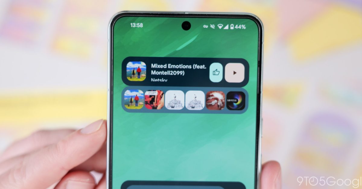
Update: YouTube Music Artist Pages Get a Redesign, But Then Get Rolled Back
Remember when YouTube Music rolled out those fancy Mark as played labels for podcast episodes and that sweet Sound Search feature? Well, get ready for another update. The service is now flipping the script on artist pages, bringing a fresh, modern look to Android and iOS users.
Current State (Update 9/8)
It seems that the redesign went live briefly, only to be rolled back. Fear not, though – you can still get a taste of what’s to come. Here’s the redesigned artist page:
You’ll notice that the button for following now sports a play icon and the "More" link next to "Top Songs" has been replaced by a snazzy arrow.
Original Redesign (7/23)
In its original iteration, the redesign brought:
- Left-aligned artist names with subscriber counts and buttons for following
- Pills for smaller touch targets
- Radio and shuffle functionalities
- A "Latest Release" card before landing on Top Songs
Feel free to take a walk down memory lane and grab a glance at the past:
figure of previous artist page
The redesign is the result of a server-side update and is currently accessible on both Android and iOS devices.
What else is cooking in the kitchen?
YouTube Music will soon sport a "Badges" feature, touting badges for your various accomplishments, like listening streaks. You can grab a glimpse of this change by tapping your profile pic, just below "Paid memberships" and "Your Recap".
Stay current with more YouTube Music scoops
