YouTube Music streamlines artist pages with new layout
Edgar Cervantes / Android Authority
TL;DR
- YouTube Music is rolling out a redesign for artist pages, featuring a left-aligned artist name, subscriber count, and follow button.
- On the other side, options to start the radio or shuffle tracks will be displayed.
- The UI changes will be rolled out for Android and iOS.
YouTube Music’s UI has had quite a few redesigns in the recent past. After rolling out the “Mark as played” feature for podcast episodes and the Sound Search tool, the platform will now get a redesigned UI for artist pages on both Android and iOS.
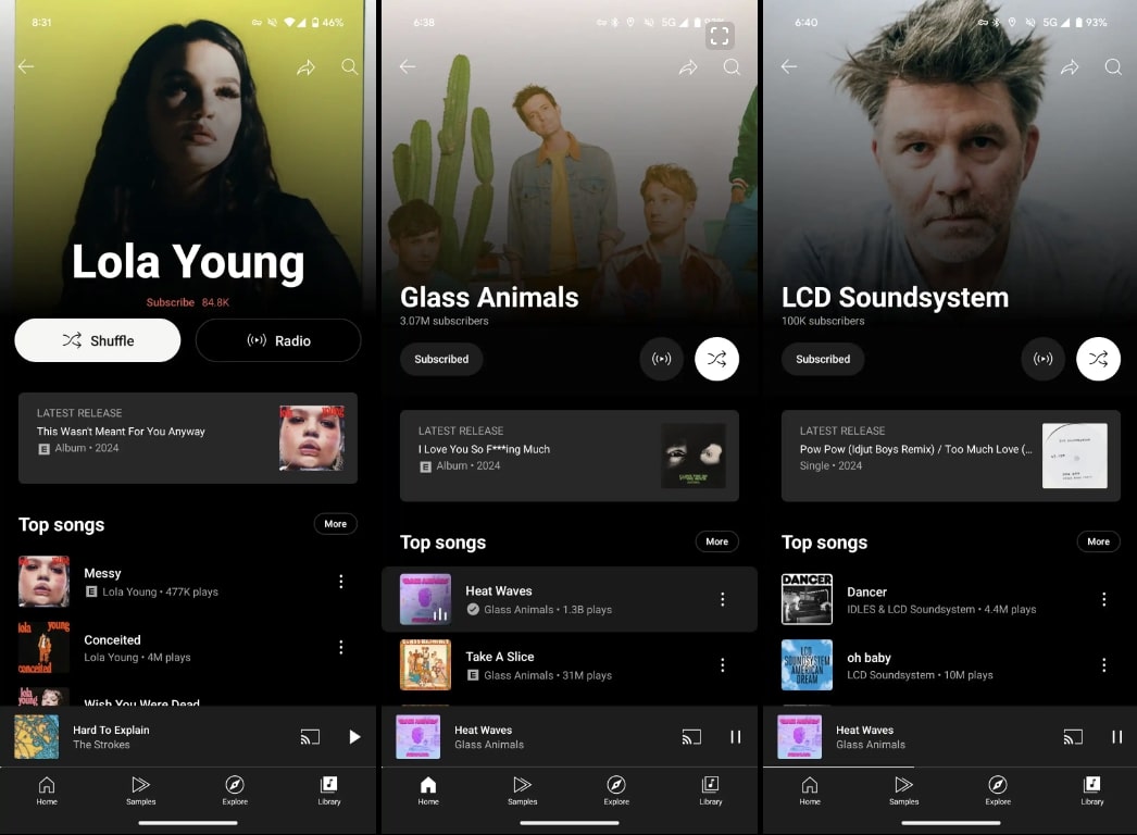
Artist pages have been refreshed, placing the artist’s name off to the left, which is followed by the subscriber count and a pill-shaped follow button (via 9to5Google). To the right of the screen, you’ll see options to start the radio and shuffle your tracks.
Additionally, if you navigate into an artist’s page, you’ll see the “Latest Release” card coming up before the “Top songs” section and the rest of the feed. You can see an example of the new layout in the image below.
In related news, it appears YouTube Music is also getting a new “Bagdes” feature, which can be found by tap your profile image or username in the top-right corner of the app. When you click this icon, you’ll be redirected to a screen with text that reads, “You don’t have any badges yet.”
According to the outlet, this feature seems to be related to an already existing YouTube Premium perk that gives members badges based on how much they use the service. Your badges should currently appear on your YouTube music profile page, which displays other listening stats as well.
Source: www.androidauthority.com

