Unlock the Power of a Sharper Gemini Experience with an Enhanced Dark Theme on Android

Gemini App Gets Dark Theme Tweaks on Android
Google’s Gemini app has been going through a series of updates, and the latest tweak is all about making it look better in dark theme. If you’re running the Android version of the app, you might have already noticed these changes. Let’s dive in and explore what’s new!
Simplified Design
The Gemini app has been simplifying its design lately, and these dark theme tweaks are just another step in that direction. Gone are the days of bright, bold colors; now, the app is all about subtle shades and minimalist design.
The "Plus" Pill
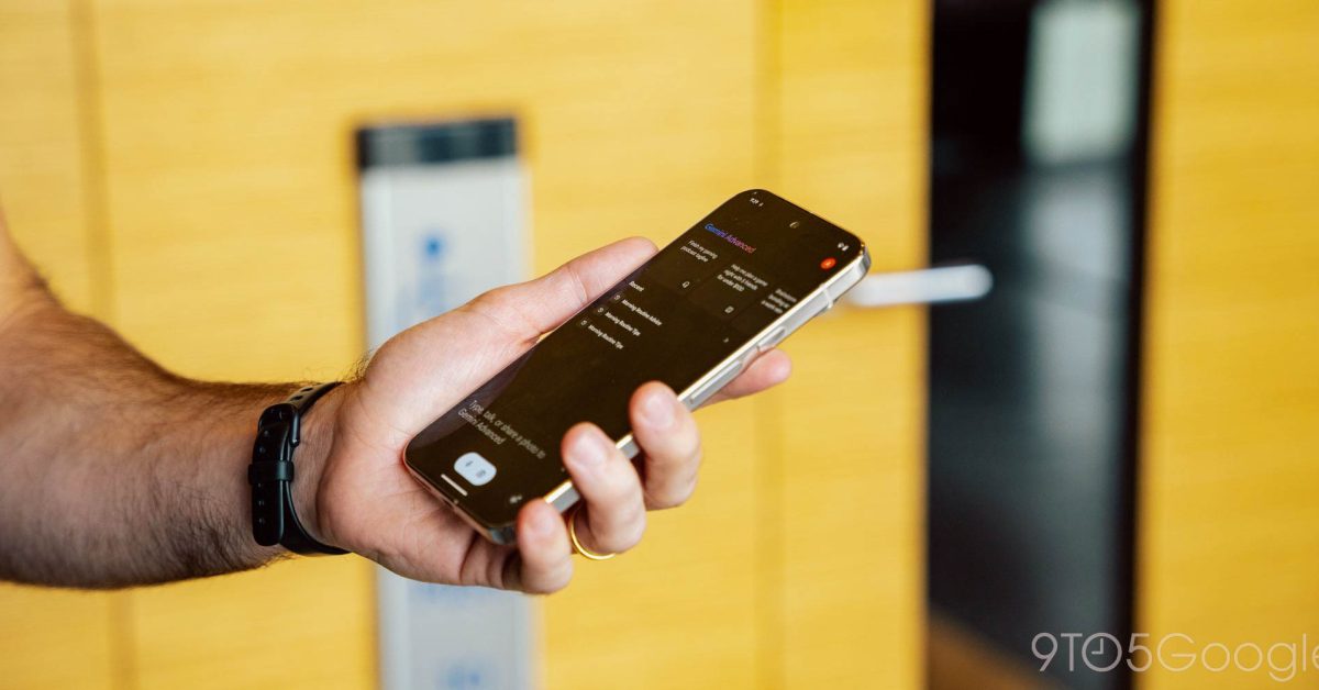
The "plus" sign at the left, which allows you to upload files or images, is no longer housed in a circle. Instead, it’s become a bit larger and rectangular, with a light gray background that matches the Gemini Live button. This change is consistent throughout the mobile Gemini experience, including in conversations.
Microphone and Camera Icon
The microphone and camera pill drop has lost its light blue background, replacing it with a very light gray color that blends seamlessly with the rest of the app’s design. This change is a welcome update, as it makes the icons easier to read in dark mode.
Gemini App Beta Version 14.42
These dark theme tweaks are available in the latest Gemini app beta version 14.42. If you’re not on the beta, you might not see these changes yet, but keep an eye out for updates!
Recent Updates to Gemini App
Google has been rolling out a slew of updates to the Gemini app, all focused on simplification. With these dark theme tweaks, it’s clear that the app is evolving to be more user-friendly and visually appealing.
Check out the images below to see the changes in action:
[Image 1: Gemini app plus pill old]
[Image 2: Gemini app plus pill new]
[Image 3: Gemini app plus pill new 2]
What do you think of these changes? Are you excited to see how the Gemini app continues to evolve? Share your thoughts in the comments below!


