Transformative Google Messages Update Revolutionizes Texting, Leaving Older Options in the Dust
Google Messages’ Text Field Redesign: A Journey of Trial and Error
Google’s latest update for its Messages app has left many users scratching their heads. The company seems to be struggling to decide on the perfect design for the text field, and the latest beta version is no exception. Let’s take a closer look at the changes and what they mean for users.
Design Evolution
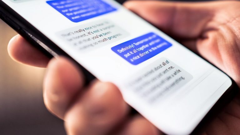
The new beta version of Google Messages features a redesigned text field, which is a departure from the previous design. In the past, the compose box had a pill-shaped design with the emoji button at the beginning, followed by Magic Compose, Gallery, and the ‘plus’ menu. However, this design was reverted in late October, and the app went back to its previous design with Plus, Gallery, and Magic Compose on the left, pushing the text field to the right.
The latest design change sees the text box positioned on the left again, but with button placements changed. The Plus button remains the first, followed by Magic Compose, Emoji, and Gallery. The Voice Memo/Send button remains outside the text box. Once something is typed, only Plus and Emoji remain.
A Design That’s Still a Work in Progress
While the new design may be an improvement over the previous one, it’s clear that Google is still experimenting with different layouts. The company may be trying to find the perfect balance between functionality and aesthetics. However, this constant change can be frustrating for users who are trying to develop muscle memory for the app.
Read Receipts Get a Redesign Too
The beta version also features redesigned read receipts, which are meant to provide a more streamlined experience. However, the implementation seems buggy at the moment, and the new design only shows up in the main message list.
Conclusion
Google’s text field redesign is a prime example of the company’s willingness to experiment and improve its products. While the constant changes may be frustrating for some users, it’s clear that Google is committed to finding the perfect design for its Messages app. Whether you like the new design or not, it’s likely that we’ll see further changes in the future as Google continues to refine its product.

