The Prime Video facelift still hasn’t fixed some key issues

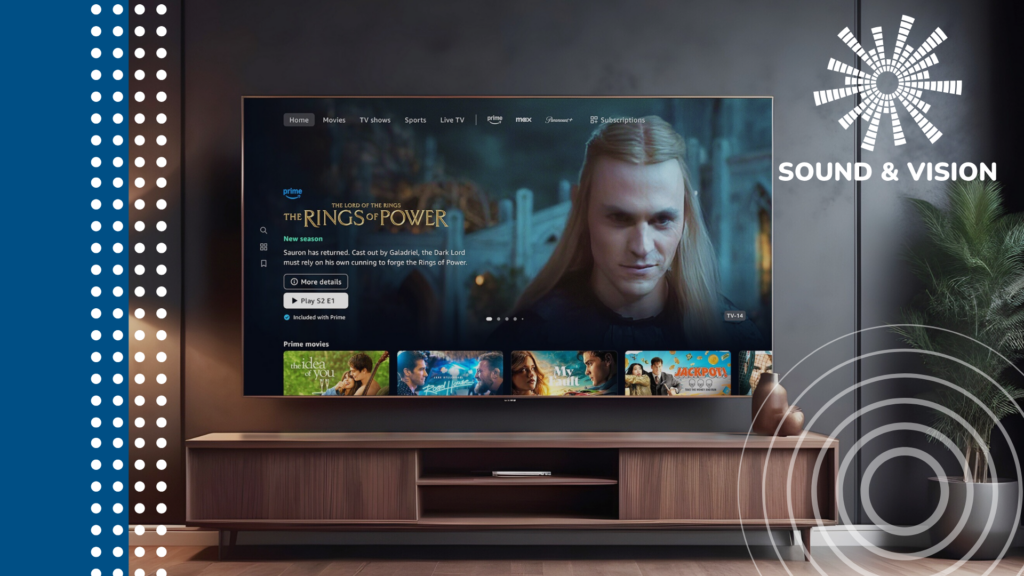
OPINION: Amazon is rolling out an update for Prime Video that’s all about bringing back “clarity and simplicity” to streaming with a visual overhaul. Open the app and it’s likely to have already surfaced on your TV.
Now I could bang on about that mention of “clarity and simplicity” as a way to acknowledge that streaming services have become cluttered, and not too easy to navigate. Skimming through my review of Prime Video I remembered that some rows have as many as 200 titles.
That just exacerbates idle scrolling and indecision when all you want to do is find something to watch quickly.
Prime Video hasn’t fixed that problem with the interface update. Browse through one of the rows (science fiction) and there can be up to 150 titles, and there are still plenty more beyond that. Who exactly is going to trawl – and trawl is the right word – through 150+ titles before finally settling on something to watch? It’s far too much.
More frustrating is that Prime Video hasn’t fixed its tagging issue with its content. The tags show what resolution and whether a film or TV is available in HDR or not; but the problem Prime Video has is that these tags seem to originate from the Prime Video store. They aren’t, in fact, altogether relevant to Prime Video streaming (or any subscription within Prime Video). John Wick: Chapter 4 currently shows as being in UHD and HDR, but when you start watching the film it streams in HD. That is both confusing and misleading.
And though Amazon has bigged up the use of AI in personalising recommendations, it still also doesn’t feel all that personal in terms of its picks.

I liked The Iron Claw (a very good and underseen film) and was rewarded with recommendations of American Pie Presents: Girls Rules, Tomb Raider, Anchorman: The Legend of Ron Burgundy, and Plane. Those films don’t seem to have much connection with each other, let alone with The Iron Claw.
It’s good that there’s an actual section for content that focuses on Prime Video, and isn’t just an amalgamation of separate subscriptions and rent/buy downloads from the Prime Store.
And it’s useful too that Amazon has included a little icon that shows which subscription package content is from, whether that’s Prime, Freevee or Mubi. But the library is still overwhelmingly in the favour of Prime Video and Freevee content, so I’m not sure what the purpose is for Prime Video users, unless you’re subscribing to every subscription available.


Add subscriptions then they’ll start to surface in the Home, Movie and TV tabs – I added Paramount+ – but there’s already enough content in Prime Video to work my way through that I’m honestly fine without adding more to the mix.
Rather annoyingly and I may be wrong about this, it doesn’t look like you can add an existing subscription/account when adding. So say if you already subscribe to Paramount+, adding a new subscription through Prime Video is effectively having two accounts.


This ‘upgrade’, if you want to call it that, feels superficial rather than digging into some of Prime Video’s problems. Some of Prime Video’s issues in the past year have been self-inflicted (the poor communication over what the new ad-free tier actually entailed) but this facelift seemed to have the potential to fix problems within the interface. Either Amazon still isn’t aware of these issues, or they’ve just glossed over them with a more attractive look.
With reports that Apple TV+ is looking to reduce its spending and potentially license films from Hollywood, it seems like it’s heading in the direction of the likes of Netflix and Prime Video, which means it’d be just another streaming service.
I’m a big fan of Apple’s original approach – a smaller library doesn’t have an abundance of options, but it does focus on quality over quantity. That’s a lesson Prime Video still doesn’t seem to have learned.
Source: www.trustedreviews.com


