Samsung Galaxy Watch Ultra review: if you can’t beat ’em, join ’em
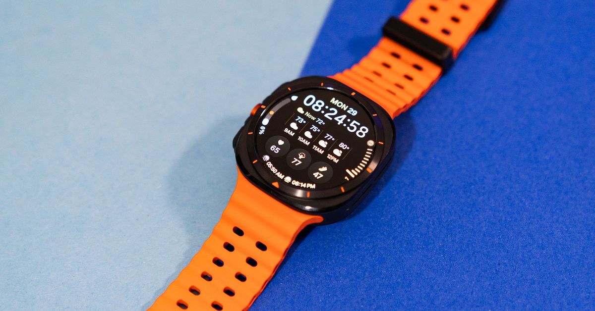
After Samsung announced the $649.99 Galaxy Watch Ultra on July 10th, I saw a few posts floating around on Threads. The gist was the same. Each post had two images: on the one side, there was the Apple Watch Ultra, and on the other, the Galaxy Watch Ultra. Hmm, users wondered. Where have we seen this before?
It’s harsh, but it was my exact first thought as well. While there are stylistic differences, it’s painfully obvious that Samsung made a list of everything the Apple Watch Ultra had that the Galaxy Watch 5 Pro — Samsung’s first attempt at a more rugged smartwatch — didn’t. It then went down the list, ticking off each feature one by one. By and large, that was a successful strategy. This is a great Android smartwatch. Arguably, it’s the best Android smartwatch.
It just doesn’t feel good.
More specifically, the Ultra’s successes don’t always feel earned. Samsung smartwatches have always had their own unique flair (usually in the form of a physical rotating bezel, which is sadly missing here). Yes, there were some Samsung-y quirks, but it gave the watches character.
Some of that quintessential Samsung-ness is still there. But it’s also undeniable that Samsung overhauled its wearable strategy to be the Apple of Android. My nerdy lil’ heart isn’t broken over it. But it does sting.
In Apple’s shadow
After wearing the Apple Watch Ultra 2 on one arm and the Galaxy Watch Ultra on the other for the last two weeks, it’s easier to say what they don’t have in common. Unlike Apple’s watch, the Galaxy Watch Ultra has a circular face (though it’s set in a squarish case). There’s no digital crown. It has FDA-cleared sleep apnea detection, a 3nm processor, and an upgraded 3-in-1 BioActive Sensor, which measures EKGs, body composition analysis, and other heart rate data. (Apple has EKGs and heart rate, but it’s still on a 5nm chip, and Masimo’s lawsuit has thrown a wrench in its sleep apnea efforts.) Naturally, the Galaxy Watch Ultra runs One UI 6 Watch and Wear OS 5 instead of watchOS.
Compare that to what they do have in common:
- An orange shortcut button (Action Button versus Quick Button)
- Three band types based on whether you do water sports, climb, or run
- An emergency siren (the Apple siren is 80db; Samsung’s is 85db)
- A watchface that turns red for easier reading at night
- 3,000 nits of screen brightness
- Dual-frequency GPS
- 10ATM of water resistance
- New multisport activity for triathletes
I could go on because there are even more similar features — like backtracking for hikes, racing past routes for runners, and functional threshold power for cyclists — but these are the major ones.
It’s understandable why Samsung has followed this route. The Apple Watch Ultra has been successful in a way that the Galaxy Watch 5 Pro has not. And as much as I hate to say it, I can’t say it was a bad idea. All of these additions and upgrades add up to a powerful and capable Android smartwatch. Overall performance is snappy, battery life is good once you finish calibrating (more on that later), and there’s great synergy if you use it with the new Galaxy Ring. I could end the review right now with “this is the Apple Watch Ultra for Android,” and you’d probably have a decent understanding of the Galaxy Watch Ultra’s strengths and weaknesses.
It’s just that when Apple does it better, it takes some of the shine from Samsung’s version. For instance, it’s easier to sync a custom hiking route onto Apple’s Ultra via the Maps app than it is to download a .GPX file from a separate app into the Samsung Health app on your phone. Apple’s Ultra has a native depth app and can be used as a dive computer. You can safely take Samsung’s Ultra for a plunge, but there are no equivalent scuba diving capabilities. Programming and using the Action Button is a bit more intuitive than the Quick Button. If I step into a dark closet, the Apple Watch Ultra’s night mode kicks on automatically. Auto night mode on the Galaxy Watch Ultra seems to be based on the actual time.
But comparison is the thief of joy. Instead, allow me to gripe about one of the Galaxy Watch Ultra’s more distinct features: its polarizing squircle design.
Squaring the circle
In recent years, Samsung watches have been overwhelmingly circular. The official line is that the Ultra’s new squarish case adds durability, though I’d argue the Pro was plenty durable without it. My working theory is that it allows for a better strap swapping mechanism — just like Apple’s — and that Samsung was purposefully going for visual similarity.
But after a few weeks of wear, I wish Samsung had just picked a rectangular display or a circular one instead of splitting the difference. Retaining the circular design would’ve kept it more visually distinct from Apple and, let’s face it, less ugly. (Though, there is an element of color preference here. I find the white titanium version to be much more fetching than the silver or my Halloween-y review unit. The black case is fine, but the strap is so orange.)
Aside from aesthetic sensibilities, Samsung’s 47mm Ultra is chunkier on the wrist than Apple’s 49mm Ultra. That’s because Samsung’s square case looks more squat on the wrist, even if the dimensions are quite similar. It also wasn’t quite as comfy for my petite wrists. The gap between the strap and my wrist was so wide, I could stuff exactly three pens or chopsticks into that space. The added chunkiness also made it difficult to find a good fit. Either I strapped the watch on way too tight, leaving marks on my arm, or it was too loose and would slide up and down my wrist.
Battery life and double pinch
The Galaxy Watch Ultra does offer some notable improvements over the Watch 5 Pro. For me, the two most impactful ones were longer battery life and the double pinch gesture.
The Ultra sports a 590mAh battery, which is the same as the Pro. However, software updates between 2022 and 2024 — and a new exercise power-saving mode — help extend the Ultra’s battery life. Battery life depends heavily on individual usage, but in testing, I got roughly 70 hours on a single charge with heavy GPS usage and power-guzzling features like the always-on display enabled. If I enabled power-saving mode once I hit 15 percent battery, I could stretch it to about 76 hours. (Note: Samsung watches take a few charge cycles to calibrate and learn your usage patterns. The first few days, I got a dismal 36–48 hours on a single charge.) I never quite hit Samsung’s 100-hour estimate, but it’s still a marked improvement over the 50–60 hours I got with the Pro.
This is true multiday battery life, though it still falls short of other multisport watches for real outdoorsy types. When I tracked a 3.5-hour hike in a remote area with no cell reception, the Galaxy Watch Ultra lost 22 percent battery, whereas my year-old Ultra 2 lost about 34 percent. While you might get away with leaving the charger at home for a one- or two-day trip, but you’re rolling the dice for anything longer.
Double pinch isn’t a new feature for Samsung watches — it’s been around for a while. It’s just more front and center now. Unlike Apple’s version, it’s not contextual, meaning it’s limited to mostly dismissing alerts, accepting calls, and controlling your phone’s camera. But putting those limitations in place ironically makes it more clear-cut for daily use. There are a few other gestures you can use, which expands your hands-free options. For instance, I programmed the knock knock gesture to open the Camera Controller app and then used double pinch to snap selfies. That’s just neat.
Mixed health tracking
Samsung made a big hullabaloo about adding Galaxy AI health features this year in the form of a new Energy Score and Wellness Tips. There’s also an upgraded 3-in-1 BioActive Sensor, which brings with it an experimental advanced glycation end products (AGEs) metric to gauge metabolic health. Unfortunately, AI doesn’t always know what’s best for you.
I wrote more about the Energy Score metric in my Galaxy Ring review, but the gist is that it’s broadly accurate with some hit-or-miss AI-generated advice. The same is true for the AI-generated Wellness Tips. For example, the other morning, I got two tips that told me that I both was and wasn’t sticking to my sleep schedule.
Meanwhile, the AGEs index metric is baffling. While you sleep, the watch measures for bodily compounds that accumulate when “protein and fat molecules are oxidized by sugar molecules.” Supposedly, that tells you how well you’re metabolically aging, but Samsung has been vague about how this actually works, the value of even having this data, and what you’re supposed to do with it. You’re graded on a spectrum from low to high — it told me I’m in the middle. To improve my score, the app advises me to eat healthy, exercise, and prioritize sleep to improve my AGEs index — which I’m already doing — while other parts of the app tell me to stop working out so hard. Is this a real thing? Maybe in the research field, but in a consumer smartwatch, this is little more than a gimmick.
The new FDA-cleared sleep apnea detection feature is relatively straightforward, but unfortunately, I found it difficult to use. The feature requires you to wear the watch for two nights while you sleep to detect disturbances based on blood oxygen levels. I had a hard time getting valid readings, partly because the Ultra’s size made it hard to get a snug fit. Eventually, I was correctly told I don’t have sleep apnea. The caveat is this feature is not a medical diagnostic tool and may not catch every instance of obstructed breathing — so take from that what you will. Like the EKG feature, it also requires you to have a Galaxy phone.
Honestly, the best fitness update was the addition of dual-frequency GPS. Compared to the Galaxy Watch 7, the Ultra was much more accurate at recording the distance of my runs. I hiked a 4.99-mile route with heavy tree cover, and the Ultra recorded a spot-on 4.99 miles, while my Apple Watch Ultra 2 logged a negligible difference of 5.03 miles.
If you can’t beat ’em…
I genuinely like the Galaxy Watch Ultra. This is the most full-featured Android smartwatch you can buy right now. I would wholeheartedly recommend it to Android users who want a longer-lasting smartwatch with a robust selection of third-party apps.
However, I fear that in copying Apple so closely, Samsung will eventually stop marching to its own quirky beat. Because it’s not just this watch — the whole Galaxy Watch lineup now mirrors Apple. There’s a budget Galaxy Watch FE to match the Apple Watch SE, a Galaxy Watch 7 sits where the Apple Watch Series 9 does, and at the top, there’s the Galaxy Watch Ultra. Samsung’s signature physical rotating bezel is now limited to last year’s Galaxy Watch 6 Classic — which wasn’t updated this year. It’s unclear if it’ll get a refresh down the road.
This truly was a bittersweet review to write. I can’t deny the Galaxy Watch Ultra fills a void for Android users who want a smarter Garmin alternative. (For a reasonable price, too.) I can’t fault Samsung for trying something different now that it has a rival in the Pixel Watch. After coasting with last year’s watches, it had to do something to regain momentum. I just never thought it would do it by making an Apple Watch.
Photography by Victoria Song / The Verge
Source: www.theverge.com

