Nothing’s CMF Watch Pro 2 lacks any sense of finish
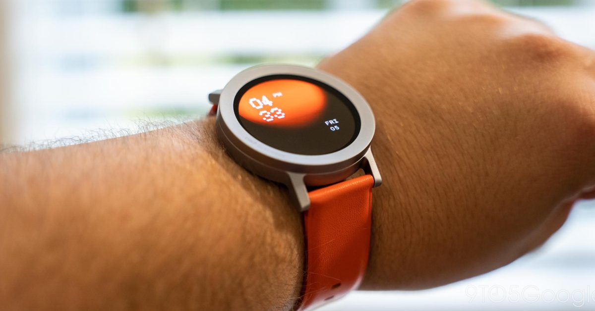
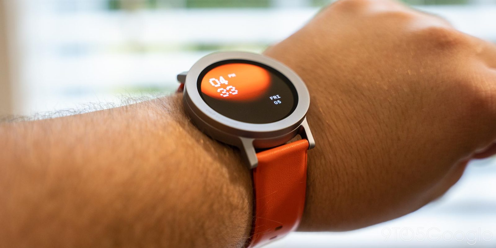
When it launched its “CMF” sub-brand last year, Nothing aimed to deliver products with a sense of fit and finish, but with a focus on fitting a tight budget. I’ve spent a few days with the brand’s new CMF Watch Pro 2, and I’m having trouble finding any of that fit and finish.
Over the past few days, I’ve been using the CMF Watch Pro 2 alongside the CMF Phone 1. And while I’m a big fan of Nothing’s new phone, I can’t say I feel the same about this smartwatch.
At $69, the CMf Watch Pro 2 is cheap, and it makes some obvious cuts to hit that price. You won’t find a full-featured OS here like Google’s Wear OS, with a basic software experience that just does what it needs to (while somewhat resembling Wear OS in places).
That software has been rough in my use. Navigation is easy and logical, but everything is laggy and less than pleasant to use. But by the standards of these super-cheap wearables, I guess it could be a whole lot worse.
My biggest issue was with the health tracking, a core piece of this watch (and virtually any wearable at this price). As mentioned, I’ve only used the CMF Watch Pro 2 for a few days, but in that time the tracking has been nothing short of bad. The core example I have for this is that, on a day where I spent four hours hiking on a disc golf course, the Watch only captured 19 minutes of exercise, never activated automatic tracking (or even prompted me to do so) despite touting that feature, and didn’t capture any heart rate data whatsoever. Just as a point of reference, my wife’s Pixel Watch 2 captured hundreds of Zone Minutes in the Fitbit app during that same time.

This could easily be a fluke, but the Watch refused to capture heart rate data or really anything of value through the other days I wore it. The only redeeming factor was that sleep tracking was roughly on par, and that the heart rate sensor, despite not consistently storing data, seems to be good at actually capturing your heart rate.
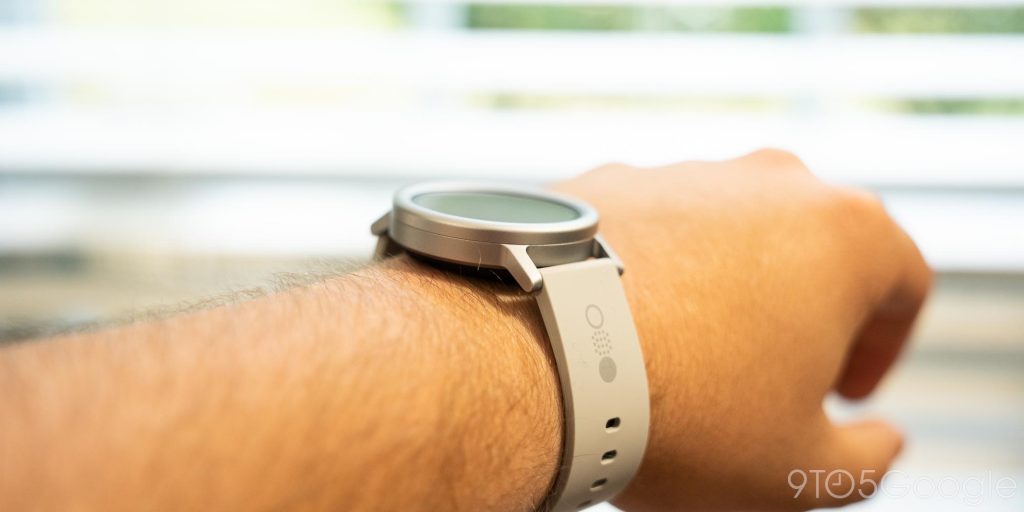
The hardware isn’t much better, either.
The Watch Pro 2 is made from aluminum, but feels like a super-cheap plastic. The rotating dial is awful, with the motion itself feeling hollow and cheap, and the smallest movement being far too sensitive in the software. I’d genuinely just rather it not do anything.
The interchangeable bezel, meanwhile, is a total gimmick, and a pretty useless one at that. Both bezel options look bare, and the squared-off one that comes included looks much worse in my view. At $19 for the other bezel option, you’re paying one heck of a premium (almost 30% of the watch’s total cost) just to make it look decent. The faux leather band included in that add-on is also cheap-feeling, and the default silicone one isn’t anything to write home about either.
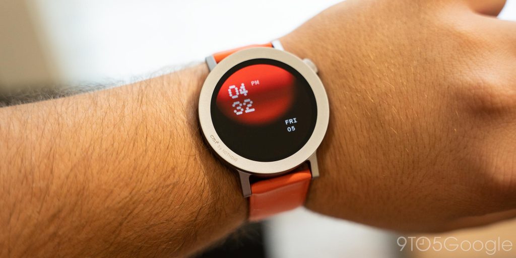
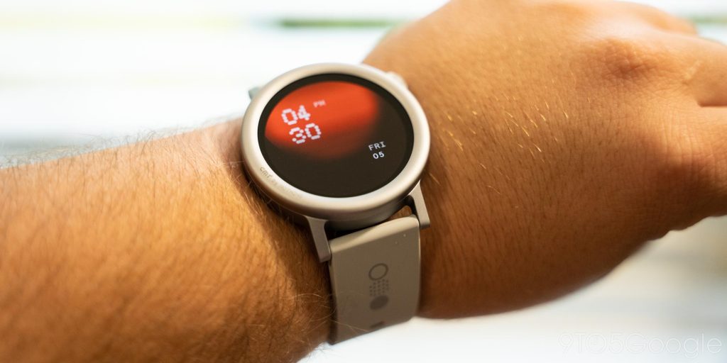
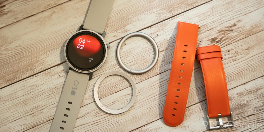
The entire experience, from hardware to software, just feels unfinished to me. There’s a good foundation here, but the cost just prevents Nothing from really completing any of the ideas at play. For instance, the display here is really good, but I wish it wasn’t wasted on a software experience that I can’t wait to stop using.
Cheap smartwatches like these, at least in my view, are rarely worth it.
Nothing’s CMF Watch Pro 2 has passable hardware and a surprisingly great display, but even for $69, I’d rather risk it on a used Wear OS watch or even do without one entirely.
Follow Ben: Twitter/X, Threads, and Instagram
FTC: We use income earning auto affiliate links. More.
#Nothings #CMF #Watch #Pro #lacks #sense #finish

