Motorola’s 2024 Razr Plus is a fun and flawed flip phone

It’s rare to feel delighted by a phone in 2024, but that’s the Motorola Razr Plus, baby.
Sure, phones are amazing little computers. For $999, which is what the Razr Plus costs, they should be. But they’re mature products — tools rather than objects of delight — and for the most part, they’ve blended into the background noise of our lives. But the Razr Plus is different, and not just because it folds in half.
I’ll give you an example: one of the background options for the media controls on the cover screen is a turntable. When music is playing, the record spins with one of the camera cutouts at the center. Press pause and the needle will lift off the record and stop. Are you kidding me? That’s adorable.
There’s so much I like about the Razr Plus that the disappointments sting a little more than if this was just any old slab-style phone. The cover screen is incredibly handy — even more so this year with some helpful UI improvements. It comes with an IPX8 rating, significantly upgrading its water resistance. And improvements to the hinge this time around make the crease all but disappear when you’re using the inner screen. Important stuff! But meaningful improvements and moments of delight don’t quite outweigh the Razr Plus’ shortcomings in the long run.
If you’re new to modern flip phones, let me give you the elevator pitch: big phone inside, small phone outside. With the phone flipped open, you have a normal smartphone with a big screen that does all the typical stuff. But when you close it, the cover screen almost acts like a second phone so you can get basic things done like check notifications and respond to texts without opening up your phone and coming face to face with everything on the big screen. Personally, I love ‘em.
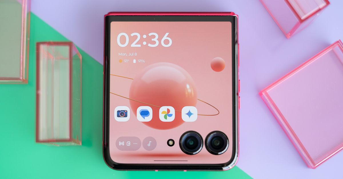
Motorola sells two versions of its modern take on the classic flip phone: the Razr Plus and a more basic Razr. This year, both Razr models come with bigger cover screens. The Razr Plus’ is a generous four inches on the diagonal versus last year’s 3.6-inch screen. It might even be about the same size as the screen on your first iPhone, even though it feels compact compared to a modern phone display. The bezel on top of the screen (are we calling that a forehead?) is much smaller than on the previous generation. It almost makes last year’s model look like a prototype.
There are also a lot more ways to customize the cover screen this time around. You can pick a handful of app shortcuts to put right on the cover screen’s main page — previously, you had to swipe to a separate panel before you could access any apps. The calendar panel is much improved, surfacing more information with a few more viewing configurations.
Even the flow for allowing apps to open on the cover screen is better. On last year’s model, you had to open the phone to approve an app for the cover screen — just once per app, but for every single app. Now, you can approve and open the app right from the cover screen notification. You have three options actually: allow, not allow, or — my favorite — “not right now,” which allows me to just slowly back away without making a commitment when I mindlessly tap on a Threads notification. Not right now, Satan.
Overall, the cover screen experience is miles better than the previous generation; more mature and less like you’re testing beta software. I’d take this every time over the Samsung Galaxy Z Flip 5, and yes I know about Good Lock. Motorola put a lot of thought into every aspect of the display, and it shows. Oh, and before we get to the whole other phone attached to this phone, shout out to two other cover screen additions: Google Assistant (including Gemini!) and an always-on display. All of my dreams are coming true.
The cover screen is a delight, but the inner screen is much more pedestrian. It’s a 6.9-inch 1080p OLED, and while the resolution didn’t bother me much in my testing, this screen is big enough to benefit from a higher pixel count. It doesn’t get quite as bright as I’d like outside, either. It’s fine, but you can definitely get a better display on a slab-style phone for the same amount of money — or even a bit less.
The good news is that Motorola adopted a new hinge design this year that minimizes the appearance of the crease when the phone is fully unfolded. There’s also the upgraded IPX8 rating; there’s no official dust resistance. The Razr Plus is certified to withstand full immersion in fresh water, a big improvement over the previous gen’s “splashproof” rating. Importantly, an IPX8 rating also puts the Razr Plus on level ground with the Galaxy Z Flip 5 (and, very likely, the Z Flip 6, which is due out soon).
The soft touch on the back panel is a nice touch as always, but the hot pink model I tested comes with a new “vegan suede” material, and I don’t think it’s a change for the better. It feels more papery, and I don’t think it’s going to wear well over time; my review unit has a couple of faint scratches that don’t budge when I try to buff them out with my finger. Considering this isn’t some bougie case — it’s the actual phone — that seems pretty bad. The other colors — peach fuzz, midnight blue, and spring green — come with a vegan leather finish like last year’s pink model, and for what it’s worth, that seems to have held up fine.
The Razr Plus uses a Snapdragon 8S Gen 3 chipset, which occupies a kind of upper-mid-tier, low-flagship space in Qualcomm’s increasingly confusing lineup. In the US, the Razr Plus comes with 12GB of RAM and 256GB of storage — healthy numbers. The combination is plenty for my day-to-day, and an extended Pocket City 2 session didn’t tax it much. And I have zero complaints about battery life, which is a real compliment for a flip phone since they tend to come with smaller batteries. The Razr Plus’ 4,000mAh cell provided enough power to get through a day of heavy use and then some.
But I am once again asking Motorola to work on its software support. The Razr Plus comes with three years of OS upgrades and four years of security updates. That’s fine; four years is probably as long as most people will want to hang onto this phone. But Samsung and Google now promise seven years for their high-end phones — even the $499 Pixel 8A comes with seven years of support. I can’t help but want more from a $999 phone. Motorola’s track record for timeliness isn’t great, either; 2023 Razr Plus owners only just started getting their Android 14 update — not a good look when Android 15 is just a few months away.
Camera performance has been another weak area for Motorola in the last few years, and I’m sorry to say that hasn’t changed in the Razr Plus.
Motorola seems like it’s trying to address the issue with a new feature called photo enhancement engine, which it says uses AI to improve noise reduction in low light, improve bokeh on portrait mode photos, and boost dynamic range. That just sounds like a list of everything phone makers have been using AI for over the past decade. Regardless, the new photo processing pipeline hasn’t addressed some core problems: portrait mode subjects are poorly isolated, background blur isn’t convincing, and color reproduction is uneven.
The system knows what to do with bright, abundant light — I got some great photos from the summit of a hike. But medium light continues to be a challenge, with flat over-brightened images and reds saturated to the point of clipping.
The Razr Plus trades last year’s ultrawide for a 2x telephoto lens, providing some nice zoom options for portraits. There’s also a 4x digital zoom for more reach, and quality is decent as long as there’s plenty of light. Without the ultrawide on the rear panel, you don’t have the same opportunity for get-everyone-in-the-photo group selfies, but the main camera is wide enough to get a couple of people in the shot.
So, here’s the dilemma: I love using the Razr Plus, but I find it very hard to recommend. The cover screen is a major part of the flip phone experience, and everything about it is better this time around. It’s easier to use, does more helpful things, and is much more customizable. If you’re a flip phone enthusiast like me, it has all the right moves.
But I wouldn’t recommend it to someone who’s more casually interested in a flip phone or finds the nostalgic factor appealing. You can get a much better camera in a slab-style phone that costs a lot less, and a good camera matters when it’s the one you carry every day. Motorola’s track record for timely software updates remains spotty, too. And the inner screen just isn’t up to the standards of a modern flagship phone.
It’s worth looking at the standard 2024 Razr if $999 seems steep for the Plus. Unlike last year, it comes with a big cover screen like its sibling, and it’s also IPX8-rated. I haven’t tested it yet, but $699 is awfully compelling for that set of features. In the meantime, the Galaxy Z Flip 6 is just around the corner. Motorola could learn a thing or two from Samsung’s software approach, with quick updates and long support timeframes. Then again, Samsung could take a few cues from the Razr Plus, too — it’s a delightful phone.
Photography by Allison Johnson / The Verge
#Motorolas #Razr #fun #flawed #flip #phone


