Here’s Why the 2025 Lincoln Navigator Still Believes in Touchpads

The 2025 Lincoln Navigator packs a massive screen atop its dashboard—over 48 inches of digital front lawn, to be exact. In that sense, Lincoln is mimicking the same trends that Cadillac, Mercedes-Benz, and others have in their respective full-size SUVs. But unlike its competitors, Ford’s luxury marque is employing a pair of wheel-mounted touchpads to drive it. And its designers reckon you’ll not only like using them, but you’ll appreciate the other benefits they afford the Navi’s cabin, too.
It’s a vastly different approach than Lincoln’s hometown rivals have opted for with the Escalade‘s 55-inch panel, but the automaker could be onto something. If you cheat and sum the 48 inches of panoramic display in the Navigator with its 11-inch touchscreen—a central infotainment screen where you’d expect to find it—the total works out to 59 inches of real estate. But touch inputs apply only to the Navi’s smaller, central panel; the wider, upper display set right under the windshield and far away from the driver is operated via the touchpads. As we know, touchpads can be polarizing.
Those two pads and large infotainment screen form the basis of a user interface philosophy Lincoln calls “up and out,” in reference to the driver’s ideal field of vision. The left pad is reserved for cruise control commands and BlueCruise, while the right one handles media and input related to whatever apps or info are on the big screen.
This is how Lincoln designers came up with an interior that they claim reduces the likelihood of distractions despite the size of that larger panel. It all comes down to the display’s placement, which is intended to keep your eyes fixed up and out, not down and close.
Lincoln Design Director Kemal Curić says the team turned to the aviation industry as a point of reference for the new infotainment scheme. “We looked at pilot workloads and we kept thinking of how to keep the distractions away and still have all the information. We found that a HUD [head-up display] is not bad, but we found something better. And that was how to keep your eyes up on the road but still have all your information at a glance, and the resolution and 3D is way better on a large screen than a HUD.
“We found the ‘eyes up and out’ approach to be the most useful,” Curić continued. “And even the interactions—if you look on the steering wheel—dictated that there are only haptic buttons, two touch buttons, and then the rest of the time you track with your thumbs with the trackpads. It keeps your eyes up, and you don’t have to actually ever take your hands away if you want to drive, or want to be engaged. It’s all within eyesight and you can still enjoy the panoramic views.”


Lincoln wanted to avoid putting in technology just for its own sake, an attitude reinforced by ex-Apple engineers who joined the team behind this new generation of the Navigator. Curić says that any technology that went into the cabin had to be genuinely useful. This time, the crew benefitted from virtual reality design tools that allowed them to iterate interior design on the fly.
“We actually started receiving data from the digital team about what is going to be on the screen,” Curić said. “It wasn’t just about putting in hardware for hardware’s sake. It was like, ‘Oh, OK. What content are we going to have? And how will we have this product in 5-10 years? Like your iPhone does, with the next iOS and with updates. What apps are we going to give the customer?’
“So, we started laying them out. Then we found the perfect size and layout for when you’re driving and when you’re stationary. We also wondered what is the passenger going to feel? What is the second row going to feel? And we started laying this out with the help of VR tools. We wouldn’t have been able to do this if we were using clay models or the paper cutouts we used to use back in the day. So that was a game changer for us.”
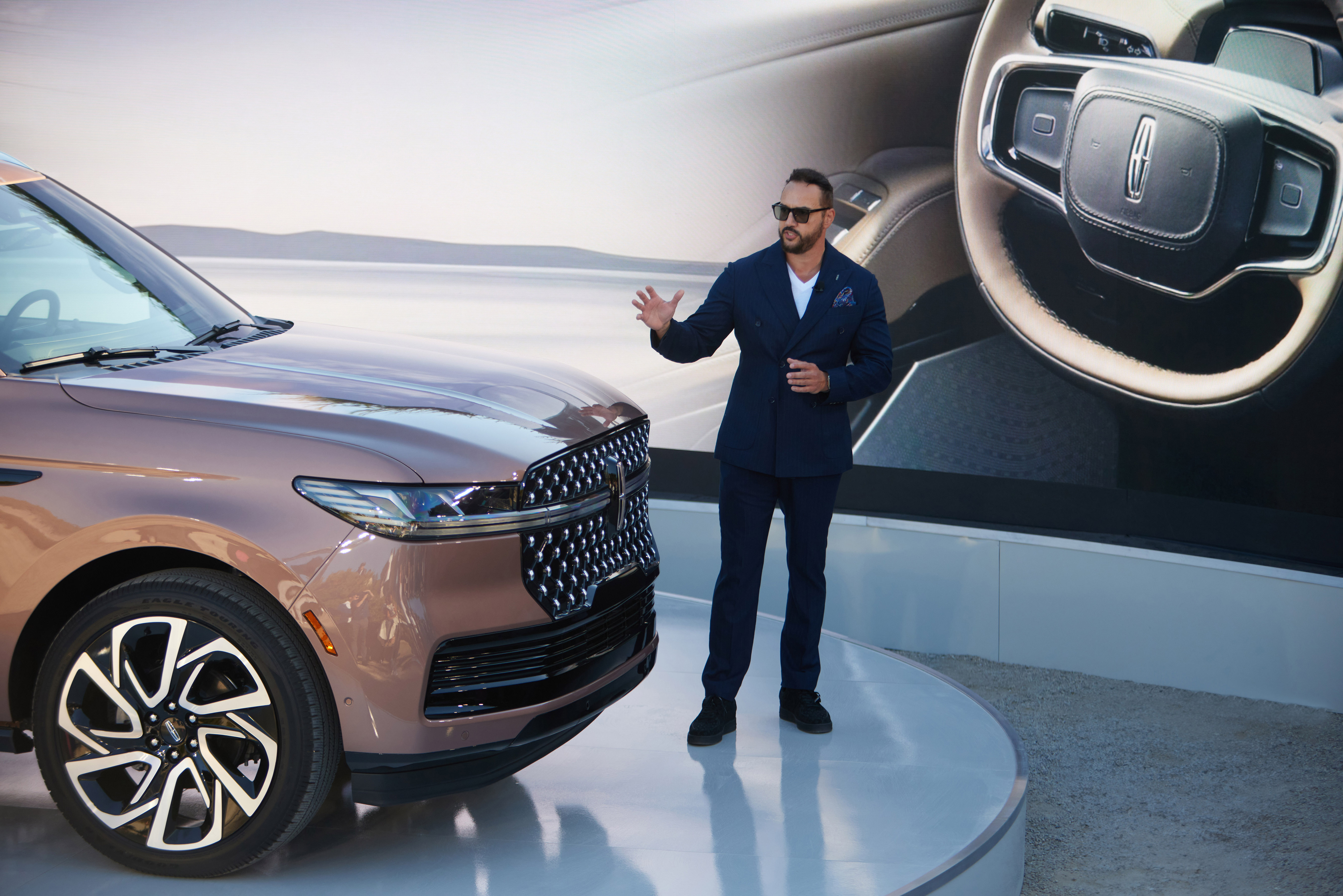
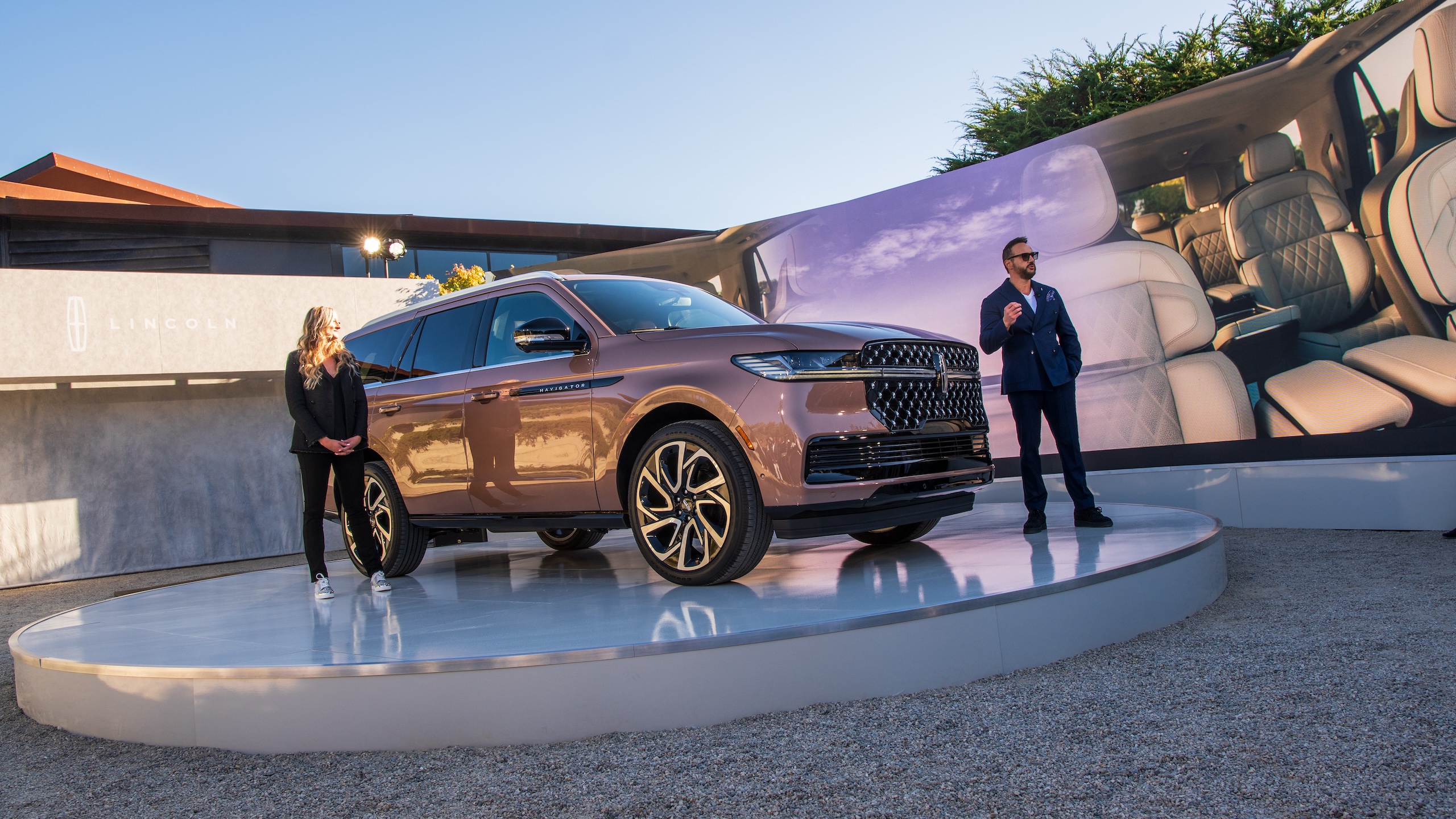
Part of that design involved heavy testing of focal points for drivers, per Chief Engineer Scott Grandinett, who told me that Lincoln decided to forego larger touchscreens that are closer on the dash compared to most other vehicles. “We had a strategy team that spent quite a bit of time with human factors, and looking at what the right balance is. On a personal level, I like the feel it gives. I like the openness you feel in the interior […] Some of the executions out there bring the screens close to you, and it’s very abrupt in that case. I think the open-air feel combined with the visibility is going to be the winning combination here.”
That sense of not having to constantly switch focal points back and forth between the road ahead and a screen down in front could be the winning combo Grandinett alludes to, but a massive screen will always present a potential for distraction. So, I asked Lincoln how it will avoid information overload, given all those pixels.
Curić said, “Well that explains the size of it, the 48-inch screen. It’s not just to put as much information as you want on there. It’s actually so you can put as much useful information and spread it out. Think about the grand entrance to your house. It’s not about putting as much furniture in—if you have the space. It’s about putting the right amount and letting that real estate breathe.”
I appreciate any automaker trying something new, especially when it comes to screens. Then again, touchpads have had a hard time catching on—just ask Lexus and Acura, who have ditched theirs for conventional touchscreens within arms’ reach. Considering the sheer width of the Navigator’s display as well as the depth of its dashboard overall, Lincoln would certainly have a lot of redesigning to do if it eventually decided to go back on this bet. Fortunately, it seems pretty confident that the “up and out” motif and the open-air cabin it enables will be a hit with drivers. Time, as always, will tell.
José Rodríguez Jr.
Got tips? Send ’em to [email protected]
Source: www.thedrive.com
