Google Search widget redesign drops most customization
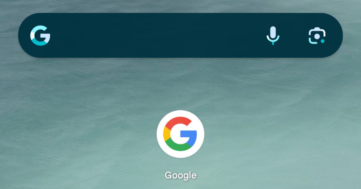
You’ve long been able to gradually customize the Google Search widget, but a redesign takes away most of the options.
Previously, you had to first place the “Google” — as it’s called — widget on your homescreen and then open the Google app > tap profile photo for account menu > Settings > Search widget > Customize widget. From here, you could change the
- Bar logo: “Google” or multicolored ‘G’ at the left
- Bar shape: Rectangle with sharp corners, Rectangle with rounded corners, or pill
- Bar color: Dark background with four-color icons, light with gray, black with white, or custom with hue and saturation adjustments
- Bar shading: Slider from See through to Solid
The new “Customize Search widget” approach is also accessed from Google app settings, but with fewer options. Namely, Google now only lets you choose from set color themes. There’s Light or Dark backgrounds with System set as the default. The Lens, microphone, and G icons stick to the official four-color design, with the company likely wanting to retain more control over the brand. It’s similar to how the Google app on iOS now offers different icons.
Of note is the addition of Device, or Dynamic Color. Previously, this was only accessible on the search bar at the bottom of the Pixel Launcher when you enabled Themed icons.
The only other customization option is a Transparency slider with “Undo” in the corner to reset. You tap “Add” to place it on your homnescreen.
It’s unclear how many people knew about the customization options that were introduced in 2018.
We’re currently seeing this Search widget redesign on Pixel and Samsung Galaxy with the Google app beta (version 15.30.x). It’s not yet widely rolled out.
FTC: We use income earning auto affiliate links. More.
Source: 9to5google.com

