Google Play Store redesign adds Search tab, persistent bottom bar
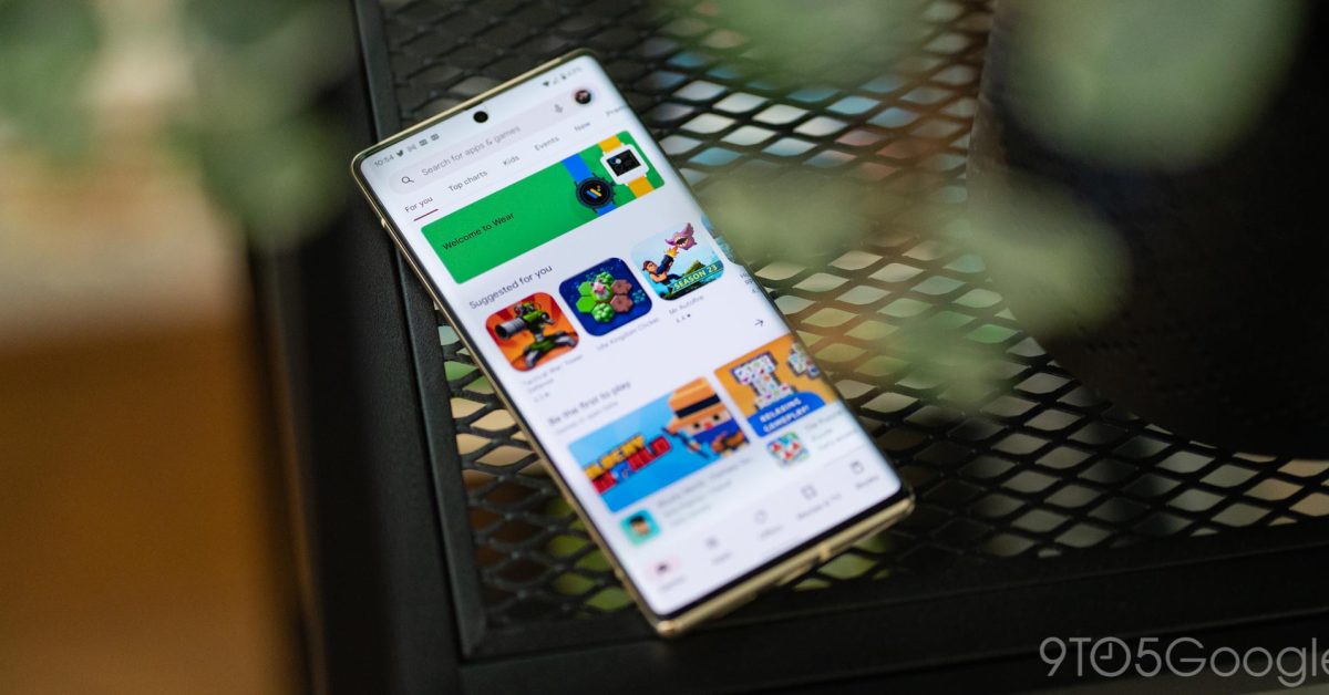
Following testing in December, Google is moving Play Store search to the bottom bar with a new tab.
Update 8/1: Google looks to be more widely rolling out the Play Store’s new Search tab. It’s been slowly coming to more users in recent weeks, and we’re now seeing it on additional phones over the past few days. That said, it’s still not yet fully launched.
Once available, you’re greeted with a “Meet the Search tab” prompt. To get users oriented to the change, tapping the space where the field previously was — which is now home to a persistent Play Points count — will result in a “Looking for the Search bar” message at the bottom.
One nice touch is that you can tap the bottom bar icon twice to quickly open the search UI and keyboard.
With this change, Google has made the bottom bar persistent. It is visible when you open app listings and developer pages. This should let you move around the app a little bit faster, but makes for an interesting look.


Original 3/20: Instead of a search bar at the top of the screen when you’re viewing the “Games” and “Apps” feeds, Google Play is switching to a “Search” tab at the center of the bottom bar.
When you open the new tab, the search bar appears at the top like before, which is somewhat anticlimactic and doesn’t do anything for reachability.
You get a grid of “You might like” and “Explore games” search terms. The latter grouping is accompanied by icons, while the former just has a magnifying glass icon. Visually, it’s not a very interesting page and a bit too text heavy. Meanwhile, making search a two tap/stage process feels unnecessary.
With this change, the app bar in Games and Apps will just show the Play logo in the top-left corner, while the notification bell and your profile avatar remains. The empty space in-between feels rather wasted.
Meanwhile, the new Search tab is only for application queries. There are no changes to the Books tab, which feels tacked on to the Play Store at this point, with the field remaining up top. (It follows Play Books widely rolling out its Material You redesign this week.)
This is rolling out with version 40.1.19-31 of the Play Store via a server-side update. It’s not yet widely available, but Google looks to be committing to this design.
Thanks, Marko
FTC: We use income earning auto affiliate links. More.
Source: 9to5google.com
