Experience Apple’s New iCloud: Shine with Fresh Features

iCloud Gets a Refresh: What’s New and What’s Next
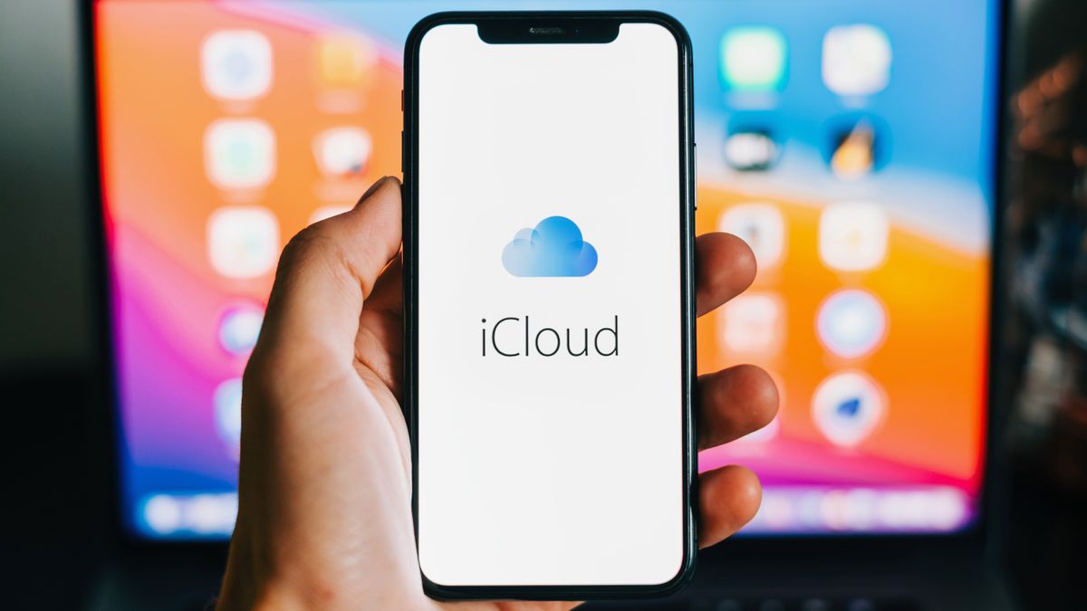
The latest update to iCloud.com has arrived, bringing a host of fresh features and design tweaks to enhance the user experience. While not revolutionary, these changes promise to make your life with iCloud a little bit easier.
Personalization and Customization
For starters, you can now customize your iCloud homepage’s background with a range of colors. Additionally, the site will automatically adopt your existing dark mode settings, because who doesn’t love a good dark mode?
iCloud Photos Gets a Boost
Navigation within iCloud Photos has been streamlined for a more efficient browsing experience. The homepage now features prominent tile options showcasing your photo albums, making it easy to find what you’re looking for. You’ll also notice a calendar icon, allowing you to jump to specific months or years and adjust the time, date, and location of your photos directly from the info pane.
iCloud Notes Gets Pinning
iCloud Notes has been upgraded, giving you the ability to pin important notes to the top of your list with a simple right-click or Control-click. Because let’s face it, some notes are more important than others.
iCloud Calendar and Drive Get Upgrades
iCloud Calendar’s design has been elevated for improved usability, and support for the Hijri calendar has been added. Meanwhile, iCloud Drive now features a Shared View tab, making it easy to see files that are shared with you.
A Closer Look
While these updates might not knock your socks off, they’ll certainly make your life with iCloud a little bit easier. And let’s be real, some of these changes were long overdue. I mean, how does a platform not have dark mode in 2024?
What’s Next?
Only time will tell what the future holds for iCloud. But one thing is certain – we’ll be keeping a close eye on the latest developments and bringing you all the news and updates as they happen. Stay tuned!


