Android 16 Quick Settings Redesign: A Sneak Peek at the Future of Android Customization
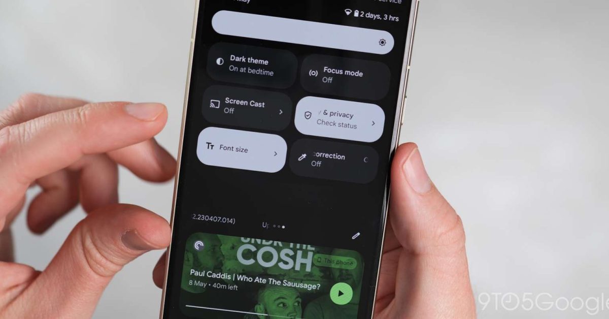
Google is cooking up a major redesign for Quick Settings, and it might debut with Android 16. Yes, you read that right – Android 16!
Quick Settings haven’t changed much since Android 12. The full UI still features eight large Tiles arranged in a 2×4 grid. But, according to a recent leak, Android 16 might be taking things in a whole new direction.
An early prototype of the redesign has been spotted in Android 15’s QPR1 build by Android Authority. This early design is far from the final product, but it gives us a glimpse into what’s to come.
Instead of a full-screen notification shade, Android 16 might be reverting back to an overlay design, allowing you to see the app you were using underneath. You’ll get a large clock, day, date, battery, and status icons upfront, but no Quick Settings (yet!).
The container shape has rounded corners at the bottom, which is a bit unusual. When there are no alerts, it’ll still display “No notifications.”
The full Quick Settings panel, currently accessible only by swiping down with two fingers, will get a modernized brightness slider housed in a pill. You’ll see a 2×2 grid of pill-shaped Tiles with text descriptions, followed by a 4×2 grid of narrower Tiles featuring icons only. You can swipe for more Tiles on additional pages. This redesign offers a significant density boost, allowing you to have 12-16 Quick Settings Tiles per page.
Google is also working on a light theme for Quick Settings, which could be a nice touch. We can’t wait to see how this redesign turns out!
