A Beautiful but Limited Foldable
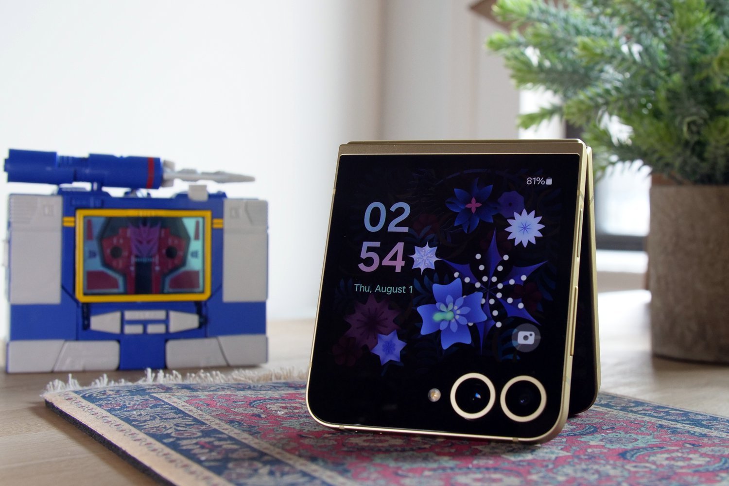
I occasionally catch myself glancing at my Samsung Galaxy Z Flip 6 review unit with a strange kind of envy. I use it every day. I like looking at its bold lines and perfect color palette, but I do not feel a sense of attachment. It’s such a striking phone, and its flat, uniform body makes it easy to handle. It’s a shame it’s so limited; I couldn’t imagine it becoming my daily device.
It’s a better phone than the Samsung Galaxy Z Flip 5 in many small and a few big ways, but it’s also the same damn phone even though it’s now $100 more expensive. Part of this is the Korean tech giant’s opinion of its phone. Both Samsung and Motorola are marketing their flip-style foldable phones as accessories. The latest Razrs are being marketed alongside handbag-style cases. These latest Galaxy Z Flips have some truly excellent color combinations, the best of which is, of course, my yellow and gold scheme.
Samsung Galaxy Z Flip 6
It’s a great-looking phone with a better hinge than ever, but there’s really not enough to justify a price increase when its so similar to the Z Flip 5.
Pros
-
Great look and feel with excellent color choices -
New hinge feels sturdier with limited crease -
IPX rating for dust resistance
Cons
-
FlexWindow cover screen is still inexplicably limited -
More expensive at $1,100 than competition or Samsung’s previous clamshell
This design shrinks your phone’s footprint in your pocket. More importantly, the minimized screen size helps decrease the time you spend on your phone. When closed, I use it to quickly check emails, Slack, or Google Maps. I’m not incentivized to bash my head against my social media feeds if I can’t scroll too well on any of my apps.
But I still need access to some features on the exterior screen, and that’s where the Z Flip 6 falls short. You have to enable the paltry few apps on the exterior screen through the phone’s settings. All those other apps are hidden away, requiring users to first download the Good Lock app from the Samsung app store and select which apps they want to see through the MultiStar widget. That’s a lot of extra effort just so I can change playlists on my cover screen when listening to Apple Music.
Once you go through the Labs settings for the cover screen, you’ll find WhatsApp is now on the cover screen, at the very least, but say goodbye to Samsung Messages by default. You get access to Netflix on the cover screen, which is probably the worst way to watch any streaming content. I can use widgets to see my step and sleep trackers, but why not give me a special UI for recent workouts in Samsung Health?
There are a few new widgets and themes, but it’s effectively the same exact experience from last year’s Z Flip 5—the worst kind of deja vu. The Z Fold 6’s battery will still last you about a day, but not much more. Even with 50 MP upgrades, its default 12 MP camera still takes very similar shots as last year’s device. It’s a good phone and gets close to the promise of clamshells. But it’s not there yet.
Samsung Galaxy Z Flip 6 Review: Design and Displays
The Samsung Galaxy Z Flip 5 was a big change for Samsung’s clamshell design with that 3.4-inch exterior “FlexWindow.” This new phone looks both similar and different than before. It is a better-feeling phone and better-looking, too. However, if you go by specs alone, there’s very little to distinguish the two.
The only display change to come to the latest in the Galaxy Z Flip series is the increased brightness. Now, the internal display offers 2,600 nits of stated peak brightness compared to the Flip 5’s 1750 nits. Otherwise, the external “FlexWindow” is still the small, 3.4-inch Super AMOLED display at 60 Hz base with a 6.7-inch interior AMOLED with a 1 to 120HZ dynamic refresh rate. That’s fine, but when the $1,000 2024 Motorola Razr+ pushed the exterior screen to a full 4 inches with the same refresh rate (165 Hz in game mode), It didn’t really feel all that new, especially since it now costs $100 more.
The hinge on this and the Z Fold 6 have been redesigned for a more sturdy action, and it’s finally rated for dust resistance. It doesn’t have any floppiness compared to 2023’s rendition after a full year of use, but you’re not going to crack it open with one hand, either. I keep thinking back to the cool cracking action of the early 2000s flip phones (and, of course, I can’t help but imagine how cool it would be to have a touchscreen version of the Nokia 8110 with the sliding cover seen in The Matrix). I want a sturdy hinge that promises long-term viability and ease of use, but we’re not quite there yet.
The new clamshell’s crease on the internal screen is far better than that of the Z Flip 5. Rather than a ravine, it feels more like a short gully. It doesn’t catch the light nearly as much, and it feels much smoother to run your finger over it. Many can’t stand the crease, so for those who want to know, it still feels present, and it might occasionally catch the light and distract you when holding at odd angles.
This is also the first flip foldable with a vapor chamber to keep the device cool under pressure. I never experienced any heat issues on the previous gen phones, especially since this isn’t the type of device you’re going to be using to do many strenuous tasks. I could play games, but the crease would still distract me too much to feel worth the hassle.
The Z Flip 6 feels and looks better than last year’s in every way that matters, and yet I can’t get excited by the changes. The back is far more scratch-resistant than the Z Flip 5, and the camera bumps look so much nicer with the metal frames. I prefer this to Motorola’s last vegan leather and vegan suede backs, especially since those tend to pick up dirt and dust very easily, even when sitting in your pocket. Now that it costs $100 more than before, I can’t shake the feeling that we should have seen something far more dramatic this go around.
Samsung Galaxy Z Flip 6 Review: Performance and Battery Life

During my review of the Galaxy Z Flip 5, I mentioned how Samsung limited its FlexWindow to widgets and a select few apps. Nothing’s changed in the year since. The big difference now is that this phone shouts “AI” from every app and service. Just as we’ve seen with most products advertising their generative AI wares, these services do little to change how you use your phone.
The new Flip 6 uses the flagship Qualcomm Snapdragon 8 Gen 3 chip and 12 GB of RAM, which is 4 GB more than the Z Flip 5. It beat out the Z Flip 5 by 100 points in single-core and close to 1,900 points for multicore setting in the Geekbench 6 CPU benchmark. I wouldn’t say it’s a snappier phone. The big difference now is the stated AI capabilities, some of which are handled on-device, but most still require an internet connection for cloud-based processing.
Some pretty important AI features work well. These kinds of flip phones are a great option for trying out live translation features like Interpreter. I tried it with native French speakers and found that it can serve relatively well, especially when translating English into another language. In the opposite direction, it can be spotty. My French conversation partner needs to speak rather slowly for the phone to pick everything up. The interface is far better than what I experienced last year with the Pixel Fold in Japan, so it will only get better from here.
The Z Flip 6 is more powerful than the previous gen, but not in any way you’ll feel during use. It’s a good thing that it still lasts a little longer than the previous Flip. The new clamshell has a 4,000 mAh battery compared to the 3,7000 mAh of last year’s. In our streaming battery tests, the Flip 6 perished after just a little bit over 16 hours. The Flip 5 lasted about 14 and a half. In practice, there’s not much of a difference between the two. The Flip 6 will give you a full day, though it might be hard-pressed if you spend the day shooting photos or videos.
And all that’s to note is that for $1,100, you’re at or above the price of high-end phones like the Pixel 8 Pro or iPhone 15 Pro, which come with much bigger batteries. When you buy the Flip, you’re paying for the complicated hinge and extra screen, not more power or longevity.
Samsung Galaxy Z Flip 6 Review: Camera

The Samsung Galaxy Z Flip 6 is supposed to have a better overall camera setup than the Flip 5, but in practice, the difference between the two is far less interesting. The big headlining jump is the 50 MP wide-angle main lens compared to the 12 MP of the previous gen. It now has a 2X optical zoom in addition to last year’s 10X digital zoom function. There’s also another pointless 10MP internal cam that’s even less useful, considering how easy it is to take selfies with the cover screen.
If you ignore the ability to shoot higher-resolution photos, the main difference between the two is the photo software. Samsung promoted its ProVisual Engine on the latest foldables, which uses a few more AI features for editing or for the same “Instant Slow-mo” we saw on last year’s high-end Galaxy S24.
You can still half-open the Flip phone and use it like a camcorder, but now the exterior sensors can use Auto Zoom, which is supposed to fill the frame with the subject. I took my phone to the gym for weekly sword practice and recorded myself, hoping the phone would do the hard work to keep me in frame. The thing is, Auto Zoom doesn’t really work that way. It’s better to take still photos with you and your friends staring at the camera from across the room.

Order Samsung Galaxy Z Flip 6 at Amazon
It is great for placing on a table and leaving it to take group shots. You can shoot at FHD resolution and 60 FPS, and with the steadier hinge, that camcorder-like action feels pretty steady, even if the base 1X zoom feels too claustrophobic. I still can’t imagine this is the type of device an influencer would use if they actually care about shooting the highest-quality videos they can, but it at least makes you feel like a content creator.
Speaking of content creation, the AI features are here again, plus the new ability to use simple gestures to draw objects into images. I’m more impressed with how well it can tell my awful, bulbous lightbulb with ears was me trying to draw a cat than with how the cat looks when put into my image. If you’re wondering what safeguards it has in place, it refused to create a pool of blood or anything graphic, though that’s partially due to how difficult it is to draw with a finger on such a small screen. It’s a fun diversion, but as with any AI art generator, it’s not accomplishing more than that.
As for how nice the pictures look now, you won’t notice too big a difference between last year’s version and this one except in specific circumstances, mostly if you’re using the 2X zoom. A 50 MP image will have more pixels than the 12 MP default, but since they’re the same sensor, Samsung’s image algorithms will matter more than total megapixels.
I took the same photos of some community chickens and plants around my block in Brooklyn with the Flip 5, Flip 6, and Galaxy S24 Ultra. The most I could say about the Flip 5 is that it tended a tiny bit warmer than either of the later phones. If I compared it to Apple’s sensors with 50 MP settings on the iPhone 14 Pro, Samsung’s pictures tend to look slightly more detailed and less washed out, but as always, it’s such a near thing.
They are good pictures, though, and I wouldn’t feel bad posting any of them on Instagram. But without a telephoto lens or better optical zoom options, it’s going to lack versatility compared to phones at around the same price.
The Flip 6 with 50 MP won’t make that much of a difference in your selfies, either. I look just as bedraggled in the square-format closed-shell selfies on the Z Flip 6 as I do on the Z Flip 5. It also makes the 10 MP selfie camera on the inside of the phone that much more awkward. Because the front screen is so limited, you won’t be using the better exterior sensors for Zoom calls as much as you may want to.
Samsung Galaxy Z Flip 6 Review: Verdict
Imagine if Samsung Made a Cheaper Version of the Galaxy Z Flip

I like the Z Flip 6 more than the Z Flip 5, a lot more, in fact, but I still wouldn’t feel comfortable with it. The main problem with foldables remains their high price. Now, Samsung is not helping itself because both the Flip 6 and Fold 6 cost more than they ever have. We’ve seen a lot of interest in the $700 2024 Motorola Razr, and that’s despite its worse camera array than Samsung’s. Clamshell phones should be an alternative to your regular phone rather than an expensive luxury device worn openly like a Gucci handbag.
I’m not complaining that this phone looks as good as it does. I’m just wondering why it can’t be both a beautiful piece of tech and something that fits a broader niche. I hope Samsung keeps the same philosophy on the next generation of Flip phones, adds a better screen, and continues to reduce the crease’s size.
Better yet, if Samsung really wants to succeed, it should stick with a less powerful CPU and drop the price by $300 to $400. Call it the Samsung Galaxy Z Flip FE, but market it as the cheaper alternative that maintains all the bells and whistles.
Let Apple’s eventual clamshell foldable be the big, expensive device that will raise the age-old complaints about Cupertino’s high costs. If foldable phones are going to continue as alternative smartphones, then there need to be at least a few that most average consumers can afford.
Source: gizmodo.com

