Google Messages testing another redesign of read receipts
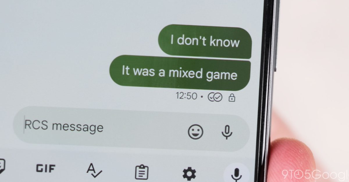
Following the last redesign in early 2023, Google Messages is testing a new look for read receipts in RCS conversations.
At the moment, read receipts appear underneath a message between the time/date and the RCS encryption lock. There are four states, with these icons replacing the previous word-based approach.
- Timer: Your message is being sent.
- Single check: Your message has been sent.
- Double check: Your message has been delivered.
- Color-filled double check: Your message has been read.
Google is now testing a redesign that places the checkmarks inside the message bubble. They appear at the right and are housed in a circle that is slightly lighter than the background. The read receipts still leverage checkmarks.
In images, they are overlaid in the bottom-right corner.
Current vs. redesign


Google’s redesign allows read receipts to appear on all previous messages instead of just the latest one. This aspect makes the read status a bit more explicit, but is unnecessary in the grand scheme.
We’ve so far received one report of this new design, with the current system in place for about 17 months.
More on Google Messages:
Thanks Braden
FTC: We use income earning auto affiliate links. More.
Source: 9to5google.com

