A Major Streaming Service Just Fixed Its Most Frustrating Feature

When browsing a streaming service for something to watch, one of the most frustrating things is finding a movie or show only to click it and discover that it’s not actually included in your subscription — that’s right, you have to pay extra to buy or rent it.
If you’re an Amazon Prime Video subscriber, you undoubtedly know this pain all too well. It’s the only popular streaming service that has seamlessly woven free (for subscribers) and paid content — as well as content from other subscription services — within its app without any real distinction.
For context, services like Netflix, Max and Disney+ don’t show such content at all because they don’t allow users to buy or rent movies. Apple and Hulu have dedicated places for buying and renting — the iTunes Store and the Hulu Store, respectively — separate from their subscription services.
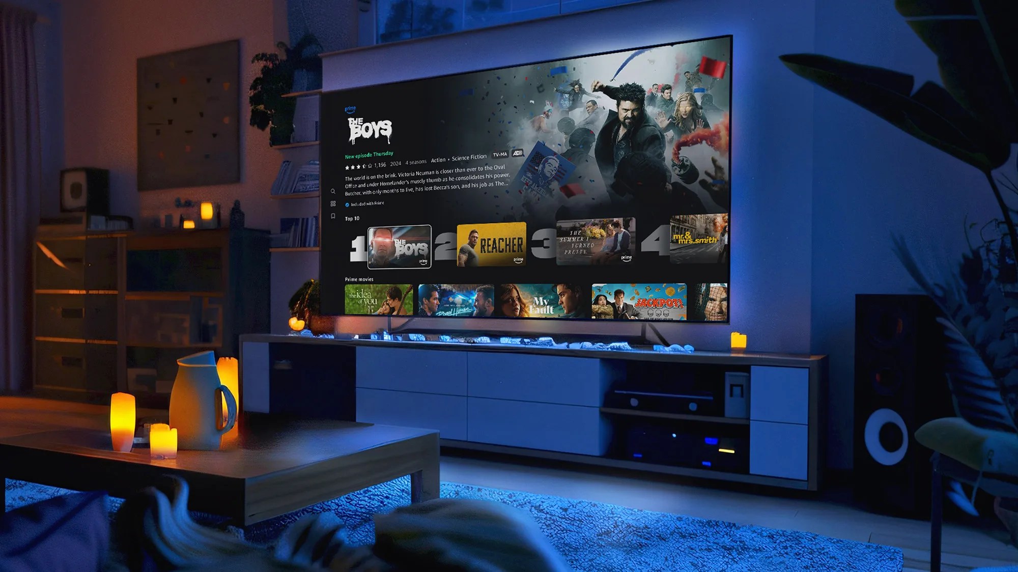
The good news is that Amazon is changing its ways — it’s rolling out new UI and a big redesign to its Prime Video app that aims to, according to its blog post, bring “clarity and simplicity back to streaming.”
What’s changing?
The biggest change is that a new navigation bar will live on top of your screen. This is where the “Home,” “Shows,” “Movies,” “Live TV,” and “Sports” tabs — which previously appeared on the side navigation bar — will live.
Most significantly, there will be a couple of new tabs that will live on the top navigation bar.
Source: www.gearpatrol.com


